Laserlines

Design and marketing agency Laserlines wanted a brand that truly reflected who they had become – a multidisciplinary team with a diverse range of services and a highly tailored approach to every project. Their existing identity no longer captured their creativity, versatility, or collaborative spirit. The challenge was to rediscover the essence of the agency and express it through a refreshed visual identity that felt both strategic and imaginative.
Brand Identity
Bespoke Typeface
Motion


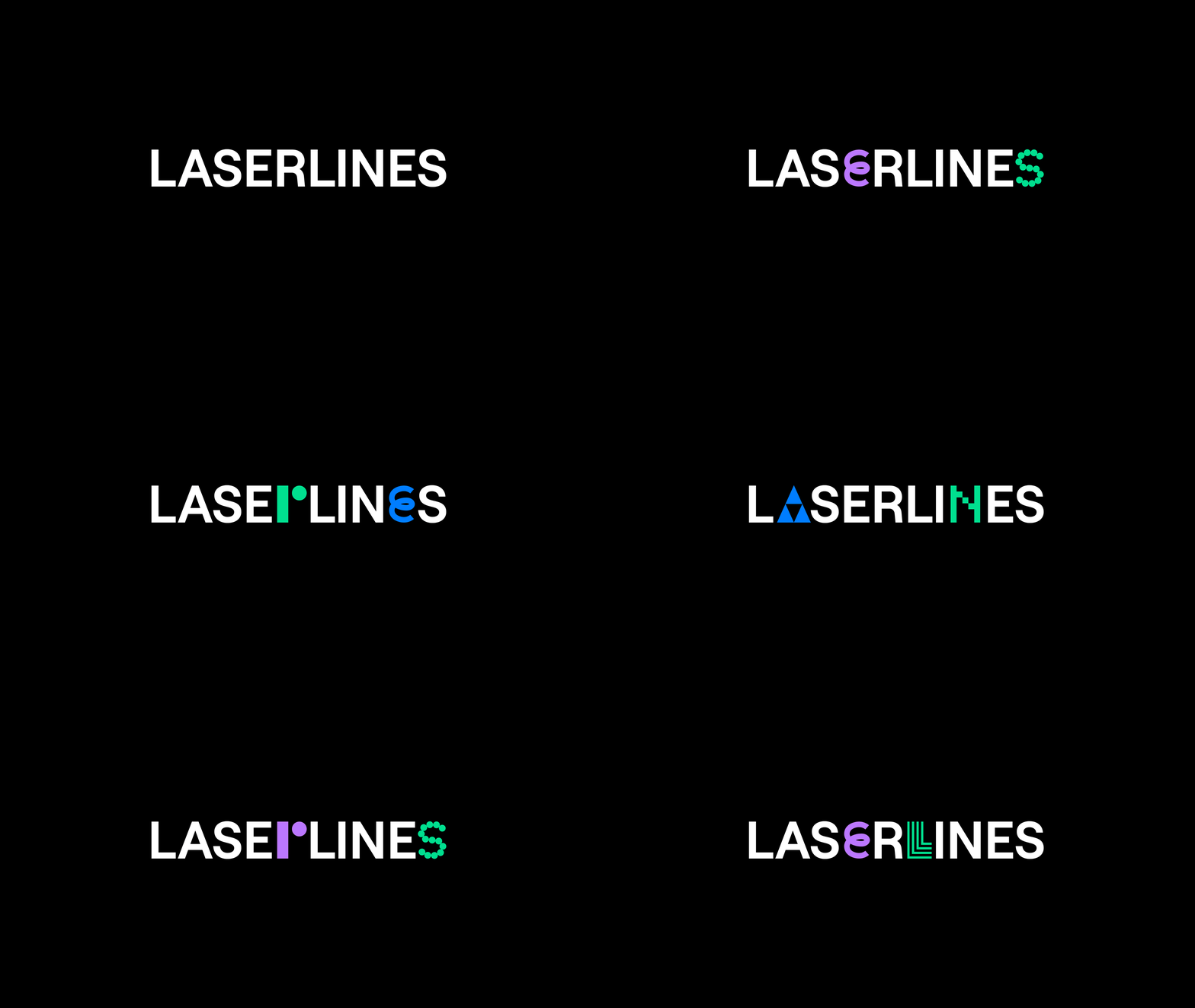
Working closely with the team, we created an identity built around a bespoke, playful typeface that merges characters with symbols – a visual metaphor for creativity, diversity, and connection. The result is a flexible and expressive brand system that celebrates Laserline’s unique energy and the individuality behind every project. Designed in collaboration with JMCO.


